

© 2009, Abhinav Agarwal. All rights reserved.


The faith which as sustained Indian civilization, which could be said to constitute (through Mahatma Gandhi) the greatest gift of the civilization to the world today, is encapsulated in part 3 of the Mundaka Upanishad, which furnished the motto of the modern Indian nation: Satyam eva jayate, nanritam, "Truth alone prevails, not unreality" (III.1.6). [page 107]
I.1.3 A great householder named Shaunaka once came
To Angiras and reverently asked:
"What is that by knowing which all is known?"
I.1.4 He replied: "The illumined sages say
Knowledge is twofold, higher and lower.
I.1.5 The study of the Vedas, linguistics,
Rituals, astronomy, and all the arts
Can be called lower knowledge. The higher
Is that which leads to Self-realization.
I.1.7 "As the web issues out of the spider
And is withdrawn, as plants sprout from the earth,
As hair grows from the body, even so.
The sages say, this universe springs from
The deathless Self, the source of life.
I.1.8 "The deathless Self meditated upon
Himself and projected the universe
As evolutionary energy.
From this energy developed life, mind,
The elements, and the world of karma,
Which is enchained by cause and effects.
I.2.7 Such rituals are unsafe rafts for crossing
The sea of samsara, of birth and death.
Doomed to shipwreck are those who try to cross
The sea of samsara on those poor rafts.
I.2.8 Ignorant of their ignorance, yet wise
In their own esteem, these deluded men
Prouf of their vain learning go round and round
Like the blind led by the blind.
II.1.2 The Lord of Love is above name and form.
He is present in all and transcends all.
Unborn, without body and without mind.
From him comes every body and mind.
II.2.2 The shining Self dwells hidden in the heart.
Everything in the cosmos, great and small,
Lives in the Self. He is the source of life,
Truth beyond the transcience of this world.
He is the goal of life. Attain this goal!
III.1.6 Truth is victorious, never untruth.
Truth is the way; truth is the goal of life.
Reached by the sages who are free from self-will.
III.1.8 Beyond the reach of the senses is he,
But not beyond the reach of a mind stilled
Through the practice of deep meditation.
III.2.3 Not through discourse, not through the intellect,
Not even through study of the scriptures
Can the Self be realized. The Self reveals
Himself to the one who longs for the Self.
Those who long for the Self with all their heart
Are chosen by the Self as his own.
III.2.8 The flowing river is lost in the sea;
The illumined sage is lost in the Self.
The flowing river has become the sea;
The illumined sage has become the Self.
III.2.9 Those who know the Self become the Self.
None in their family forgets the Self.
Freed from the fetters of separateness,
They attain to immortality.

The fact is that despite its mathematical base, statistics is as much an art as it is a science. A great many manipulations and even distortions are possible within the bounds of propriety. Often the statistician must choose among methods, a subjective process, and find the one that he will use to represent the facts. In commercial practice, is about as unlikely to select an unfavorable method as a copywriter is to call his sponsor's product flimsy and cheap when he might as well say light and economical. [page 120]
As Henry G. Felsen, a humorist and no medical authority, pointed out quite a while ago, proper treatment will cure a cold in seven days, but left to itself a cold will hang on for a week.There is a part of the human brain, and indeed heart also, that is so eager for the 'truth', in whatever context, in whatever form, that we look at numbers with a reassuring feeling - numbers convey accuracy, preciseness, and authority, which in turn leads us to accept them as being truthful. Words can be used to lie, numbers cannot - so goes the seductiveness of numbers.
The secret language of statistics, so appealing in a fact-minded culture, is employed to sensationalize, inflate,confuse, and oversimplify. ... But without writers who use the words with honesty and understanding and readers who know what they mean, the result can only be semantic nonsense. [page 8]
If your sample is large enough and selected properly, it will represent the whole well enough for most purposes. If it is not, it may be far less accurate than an intelligent guess and have nothing to recommend it but a spurious air of scientific precision. [page 13]
The basic sample is the kind called "random." It is selected by pure chance from the "universe," a word by which the statistician means the whole of which the sample is a part. ... The test of the random sample is this: Does every name or thing in the whole group have an equal chance to be in the sample? [page 20, 21]But, this kind of a 'pure' random sample is very difficult and very expensive to get. After all, if you were to try and obtain such a 1% random sample of the Indian population, you would end up with 10 million people, would have to travel the length and breadth of the country, across 626 districts, spread across 28 states and 7 union territories, cover an area of more than 3 million square kilometers, selected from over 1.15 billion people. That is one hundred and fifteen crore people. Or if you want to look at only the electorate, that would be some 715 million people - 715 followed by six zeros: 715000000. The summary of this is that obtaining a truly random, and representative sample in this case is very, very difficult, and the exercise best left to those educated and trained in this art and science.
A more economical substitute, which is almost universally used in such fields as opinion polling and market research, is called stratified random sampling. [page 21]
No conclusion that "sixty seven per cent of the American people are against" something or other should be read without the lingering question, Sixty-seven per cent of which American people? [page 22]Does it, should it, come as a distressing surprise then that our media-persons gleefully parrot out statistics with such authority that you would be forgiven for thinking they actually knew what they were talking about? The results of a survey, for example, where people SMS their choice in, are treated with sacrosanct reverence, and through the magic of determined repeating acquire the halo of truth.
So when you see an average-pay figure, first ask: Average of what? Who's included? The United States Steel Corporation once said that its employees' average weekly earnings went up 107 per cent between 1940 and 1948. So they did-but some of the punch goes out of the magnificent increase when you note that the 1940 figure includes a much larger number of partially employed people. If you work half-time one year and full-time the next, your earnings will double, but that doesn't indicate anything at all about your wage rate. [page 35]If you pay an autorickshaw 20 rupees to take you from MG Road to Museum Road in Bangalore, and if that ride takes 5 minutes, would you extrapolate this (5 minutes, 12 times an hour, 10 hours a day, 365 days a year) to claim that the autorickshaw driver's annual earnings are close to nine lakh rupees? No. You wouldn't. You shouldn't.
Users report 23% fewer cavities with Doakes' tooth paste, the big type says. You could do with twenty-three per cent fewer aches, so you read on. These results, you find, come from a reassuringly "independent" laboratory, and the account is certified by a certified public accountant. What more do you want?
Yet if you are not outstandingly gullible or optimistic, you will recall from experience that one tooth paste is seldom much better than any other. Then how can the Doakes people report such results? Can they get away with telling lies, and in such big type at that? No, and they don't have to. There are easier ways and more effective ones.
The principal joker in this one is the inadequate sample - statistically inadequate, that is; for Doakes' purpose it is just right. That test group of users, you discover by reading the small type, consisted of just a dozen persons.
...
Sooner or later, by the operation of chance, a test group is going to show a big improvement worthy of a headline and perhaps a whole advertising campaign.
[pages 37, 38]
It is all too reminiscent of an old definition of the lecture method of classroom instruction: a process by which the contents of the textbook of the instructor are transferred to the notebook of the student without passing through the heads of either party. [page 47]
Just to clear the air, let's note first of all that whatever an intelligence test measures it is not quite the same thing as we usually mean by intelligence. It neglects such important things as leadership and creative imagination.Chapter 5, "The Gee-Whiz Graph", briefly gets into the area of lying with graphs. By using a scale that does not start at zero, or a line graph that is truncated to show only a small window of the actual graph, or by means of a broken graph, and more. See these examples below that I (re)created from the book below.
It takes no account of social judgment or musical or artistic or other aptitudes, to say nothing of such personality matters as diligence and emotional balance. On top of that, the tests most often given in schools are the quick-and-cheap group kind that depend a good deal upon reading facility; bright or not, the poor reader hasn't a chance. [page 54]


If you can't prove what you want to prove, demonstrate something else and pretend that they are the same thing. In the daze that follows the collision of statistics with the human mind, hardly anybody will notice the difference. [page 74]Chapter 8, "Post Hoc Rides Again", is on correlations and causality. The title of the chapter is taken from the Latin phrase, "Post hoc ergo propter hoc", which means "after this therefore because of this", which is an example of a logical fallacy. If "a" follows "b", did "b" cause "a"? Or to put it another way: if the newspaper is delivered everyday at 7am, and if you go to the toilet at 7:30am, then did the newspaper delivery cause you visit the loo? You would most likely argue not. But you cannot dispute there is a strong correlation, though causality would be disputed, and rightly so, unless there is something in the newspaper content, everyday, that causes 'movement'.
...
If you can buy a juicer that is twenty-six per cent more effective, why buy any other kind? ... just what does that figure mean? Twenty-six per cent more than what? When it was finally pinned down it was found to mean only that this juicer got out that much more juice than an old-fashioned hand reamer could. It had absolutely nothing to do with the data you would want before purchasing; this juicer might be the poorest on the market. [page 77]
...
There are often many ways of expressing any figure. You can, for instance, express exactly the same fact by calling it a one per cent return on sales, a fifteen per cent return on investment, a ten-million-dollar profit, an increase in profits of forty per cent (compared with 1935-39 average), Or a decrease of sixty per cent from last year. The method is to choose the one that sounds best for the purpose at hand and trust that few who read it will recognize how imperfectly it reflects the situation. [page 82]
...
It is an interesting fact that the death rate or number of deaths often is a better measure of the incidence of an ailment than direct incidence figures-simply because the quality of reporting and record-keeping is so much higher on fatalities. [page 84]
Misinforming people by the use of statistical material might be called statistical manipulation; in a word (though not a very good one), statisticulation. [page 100, bold emphasis mine]One lesson I remember being taught in math class in school, and I cannot in any honesty claim to have either learned the lesson precisely as the teacher intended to teach it or to have followed that advice as dilligently as I should have, was about precision and decimal places when doing multiplication.
For a spurious air of precision that will lend all kinds of weight to the most disreputable statistic, consider the decimal. Ask a hundred citizens how many hours they slept last night. Come out with a total of, say, 783.1. Any such data are far from precise to begin with. Most people will miss their guess by fifteen minutes or morc, and there is no assurance that the errors will balance out.But this obsession with precision can look silly at times, and make one appear awfully uneducated at other times.
... announce that people sleep an average of 7.831 hours a night. You will sound as if you knew precisely what you were talking about. If you had been so foolish as to declare only that people sleep 7.8 (or "almost 8"') hours a night, there would have been nothing striking about it. It would have sounded like what it was, a poor approximation and no more instructive than almost anybody's guess. [pages 106, 107]
... when the president of a flower growers' association said, in a newspaper interview, that "flowers are 100 per cent cheaper than four months ago," he didn't mean that florists were now giving them away. But that's what he said. [page 109]This above is an example of using the wrong base for comparison. 100% of a number is equal to the number itself, right? So if flowers cost Rs 10 a dozen four months ago, and if indeed the prices are now 100% cheaper, then that would mean they cost Rs 10 less a dozen. Which means, to lead this argument to its logical but (almost) absurd conclusion, that flowers are being sold for free (not "sold freely", which means something else). That is not the case. What is happening is that flowers are being sold for Rs 5 a dozen. And the the person is doing is thinking that since 5 is 100% of 5, therefore flowers are 100% cheaper than four months ago. That is wrong. Flowers are 50% cheaper than four months ago, since the price decrease has been 5 rupees, and 5 is 50% of 10. There you go.
In her History of the Standard Oil Company, Ida M. Tarbell went even further. She said that "price cutting in the southwest ranged from 14 to 220 percent." That would call for seller paying buyer a considerable sum to haul the oily stuff away. [page 109]Another example of how this base effect can be used to one's advantage is this: supposing you earn one lakh rupees a year. You get a hike of ten thousand ruppes, so that your salary is now 1,10,000 rupees. Your company says you have got a 10% hike. Which is correct. You however say that your salary is now only 9% higher than your old salary. Which is also correct, in a way, if you calculate ten thousand rupees as a percentage of your NEW salary.
Another fertile field for being fooled lies in the confusion between percentage and percentage points. If your profits should climb from three per cent on investment one year to six per cent the next, you can make it sound quite modest by calling it a rise of three percentage points. With equal validity you can describe it as a one hundred per cent increase. [page 114, 115]
Percentiles are deceptive too. When you are told how Johnny stands compared to his classmates in algebra or some aptitude, the figure may be a percentile. It means his rank in each one hundred students. In a class of three hundred, for instance, the top three will be in the 99 percentile, the next three in the 98, and so on. The odd thing about percentiles is that a student with a 99-percentile rating is probably quite a bit superior to one standing at 90, while those at the 40 and 60 percentiles may be of almost equal achievement. This comes from the habit that so many characteristics have of clustering about their own average, forming the "normal" bell curve we mentioned in an early chapter. [page 115]
 Let's see this with an example. I used Excel to generate a pseudo-random distribution of 250 scores, with each score between 0 and 30. How exactly did I do this? Well.. by using the randbetween(0,1) function thirty times for each of the 250 rows, and then adding up the values for each row to get to the score. Plotting a histogram gave me a nice looking bell curve.
Not all the statistical information that you may come upon can be tested with the sureness of chemical analysis or of what goes on in an assayer's laboratory. But you can prod the stuff with five simple questions, and by finding the answers avoid learning a remarkable lot that isn't so. [page 122]The five questions are:
Who Says So? How Does He Know? What's Missing? Did Somebody Change the Subject? Does it Make Sense?
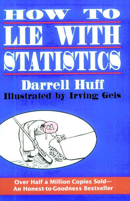
While the longevity of How to Lie with Statistics must have come as a surprise to Huff, the seeds for its initial success were carefully planted. Remarkably, it was reviewed twice in The New York Times, a feat that would be almost impossible today. First, on January 4, 1954, Burton Crane gave it a column [4] and-a-half in “The Business Bookshelf”; then on January 16, it got another half column [30] in Charles Poore’s “Books of The Times.” Both reviews were highly positive, though not especially insightful. In August of 1954, Huff got to follow up in the Times with a more informative feature article [11] of his own, “How to Spot Statistical Jokers.” At the bottom of the first column, Huff added a footnote that says “Darrell Huff is a specialist in reading between statistical lines. He is the author of the book How to Lie with Statistics.” This does indeed seem to be how the world most remembers him today.
...
When one asks what may have led to the remarkable success of How to Lie with Statistics, it is natural to consider four likely sources: the title, the illustrations, the style and the intellectual content. In each case, from the perspective of fifty years, one finds more than might have originally met the eye.